From CSV to Stunning Chart in 10 Seconds: Introducing Automated AI Visualization
The DatumFuse Team
July 11, 2025
We've all been there. You have a spreadsheet full of valuable data—sales figures, survey results, user metrics—and you need to share the key insights with your team. But you're stuck staring at a wall of numbers, knowing that a powerful chart is locked away inside, if only you had the time and expertise to build it.
The process is often slow and frustrating. Which chart type should you use? A bar chart? A line graph? How do you format the axes? How do you make it look professional enough for a presentation?
This friction, this gap between raw data and clear insight, is exactly why we built the flagship feature of DatumFuse.AI: Automated AI Data Visualization.
The Old Way: Manual, Slow, and Frustrating
Traditionally, creating a simple chart from a CSV file involves a tedious, multi-step process.
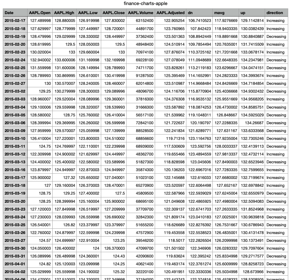 Your data has a story to tell, but it's trapped in rows and columns.
You have to manually select data ranges, navigate confusing menus, guess which chart type will work best, and then spend even more time tweaking colors and labels to make it look presentable. This process can take anywhere from minutes to hours.
The DatumFuse.AI Way: Instant, Intelligent, and Effortless
Our Automated Visualization tool flips the script. We believe you should be able to get from data to decision in seconds. Our process is designed to be as simple as possible, powered by a sophisticated AI on the backend.
Here's how it works:
Step 1: Upload Your CSV File
Navigate to our Automated Visualization tool. You'll be greeted by our clean "Magic Box" interface. Simply drag and drop your CSV file or click to choose it from your computer.
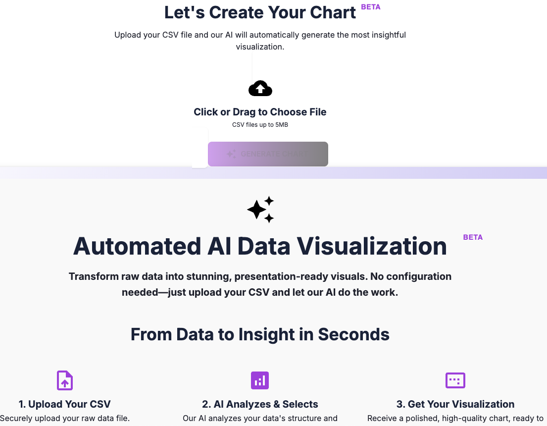
Step 2: Click "Generate Chart"
That's it. There is no step two for you. Once your file is selected, just click the "Generate Chart" button.
Behind the scenes, our AI gets to work. It:
- Analyzes the structure of your data.
- Identifies the data types in each column (text, numbers, dates).
- Determines the relationships between the columns.
- Selects the single most effective chart type to represent the primary insight in your data.
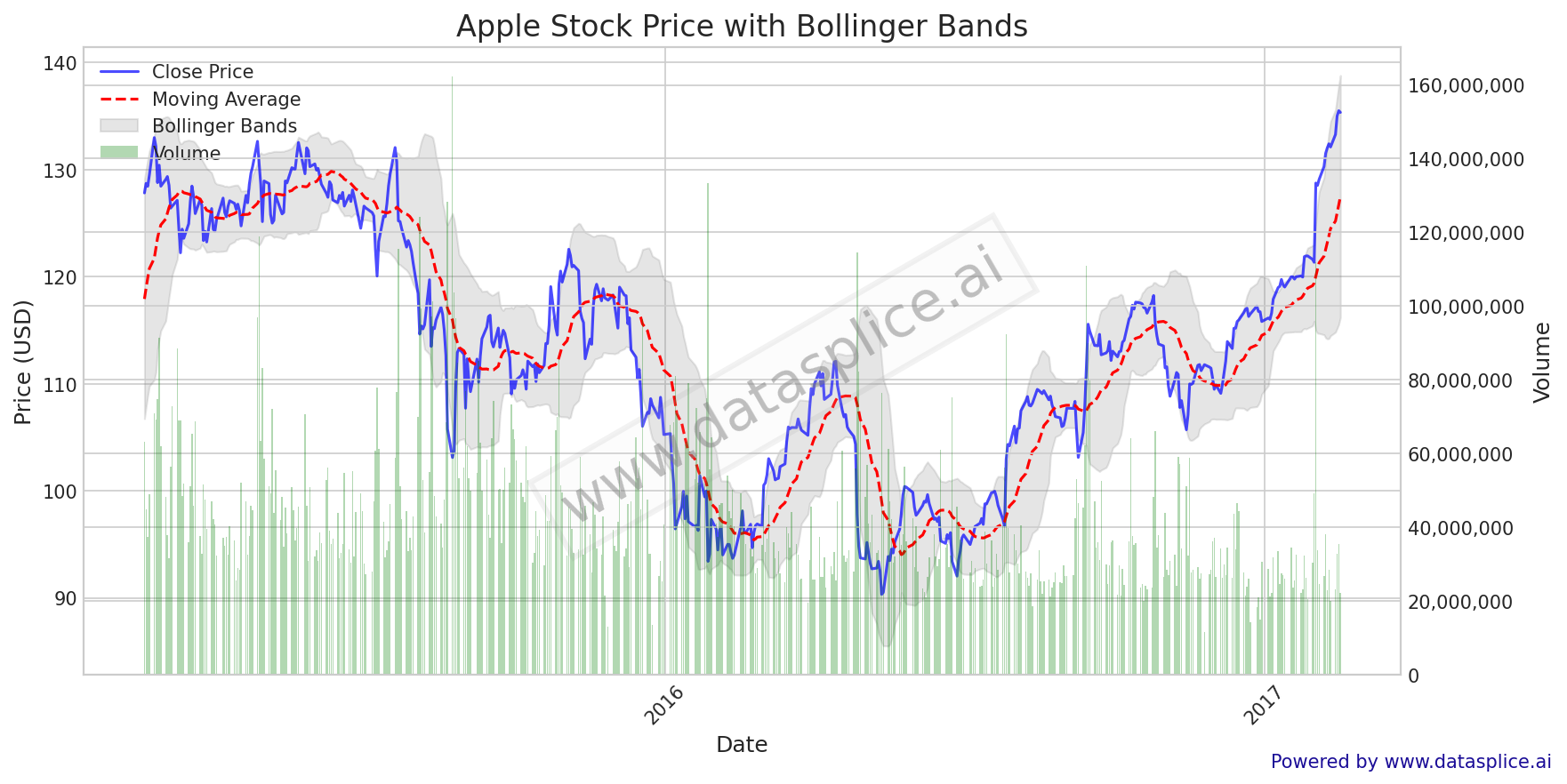
Step 3: Get Your Insightful, Presentation-Ready Chart
In seconds, you'll receive a beautifully designed, high-quality visualization. It's not just a basic plot; it's a professional-grade chart with clean styling, intelligent labels, and a clear focus, ready to be downloaded and dropped directly into your report, presentation, or social media post.
See It in Action: The 30-Second Challenge
Words don't do it justice. Watch this short video to see the entire process, from a raw CSV file to a finished chart, happen in real-time.
Click the image above to watch the full demo video.
Why This Changes Everything
This isn't just about saving time; it's about unlocking creativity and making data accessible to everyone.
- For Marketers: Quickly visualize campaign results without needing a data analyst.
- For Students & Researchers: Create professional charts for your papers and presentations in an instant.
- For Business Analysts: Rapidly explore new datasets to find initial trends before diving deeper.
Stop wrestling with software and start communicating with data. Give the DatumFuse.AI Automated Visualization tool a try today—it's free to use during our beta period.